Schoology Navigation Redesign
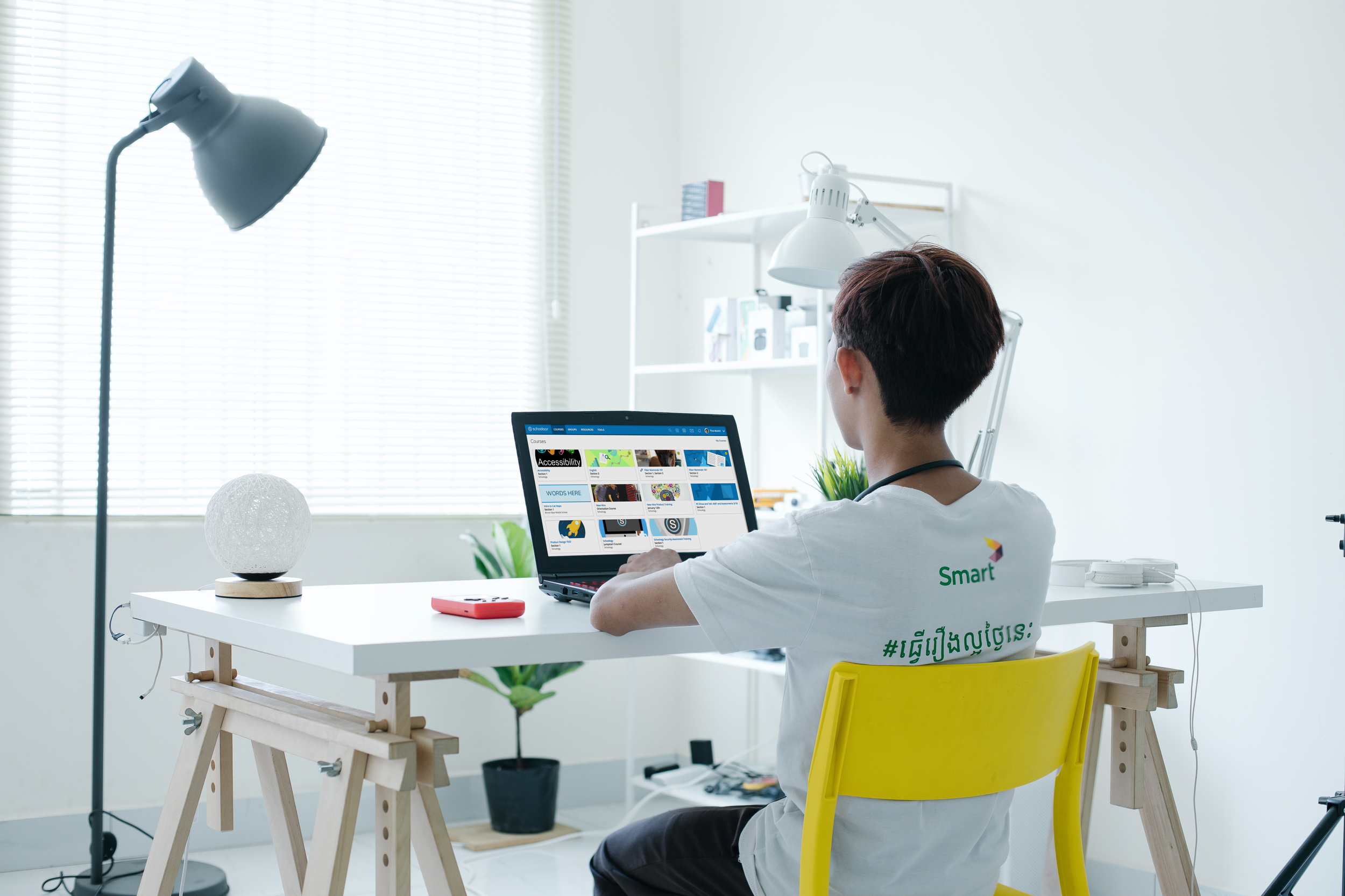
Photo by Arseny Togulev
The Business Problem
Schoology is used by students and teachers on all kinds of devices from iPhones to desktop computers. Unfortunately, Schoology’s navigation made it difficult to design responsive web/mobile hybrid pages that would work well on small and large screen sizes. It also wasn’t meeting accessibility guidelines.
My Role
I led the research and information architecture and partnered with another designer on the interaction and visual design.
Project Goals
1
Students, Teachers, School Administrators, and Parents all use Schoology. Different motivations and goals meant that a one-size-fits-all approach wouldn't provide the best experience for our users
2
Our students, teachers, and administrators are using all kinds of devices in all different places. Students use their smartphones to do homework while teachers use laptops to grade assignments. As we worked to make pages responsive the navigation needed to support the different screen sizes as well.
3
Make Schoology usable for all learners and educators by ensuring an accessible navigation.
Before the Redesign
Schoology’s old navigation was dated and cluttered. There was both a top and left navigation on most pages which took up valuable screen real estate and made the site seem overly complex.
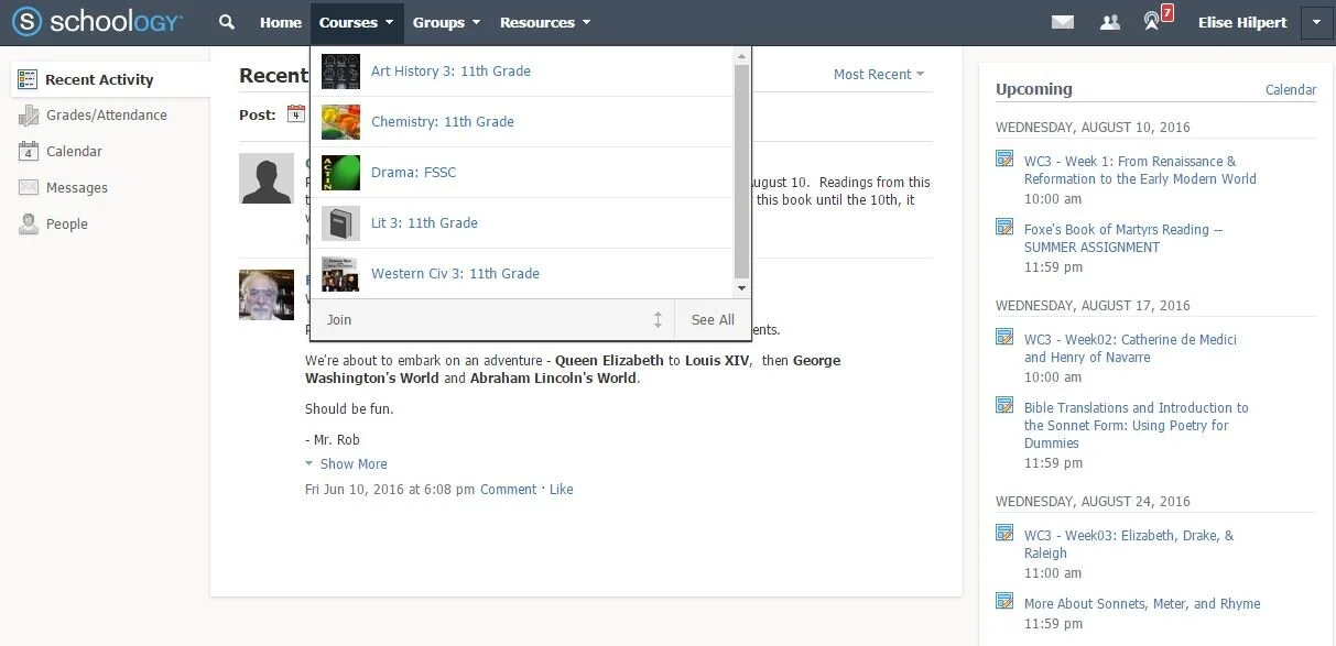
Screenshot from Francis Schaeffer Study Center

Data-informed Design
Using behavioral data from the application, Pendo, we determined the most used elements of the website. I made an inventory of all of the pages and created a document to keep track of the information architecture decisions.
User Research
While some user research had been conducted before I joined this project, we still needed to investigate the rest of our open questions. The biggest one I had was how to organize our system admin tools that used to exist on the left hand menu. I started by understanding how often they use the different pages and when in their workflow they perform different activities. Next we showed some concepts.
Information Architecture
Armed with user research and usage data I was able to construct the information architecture for the new Schoology navigation.
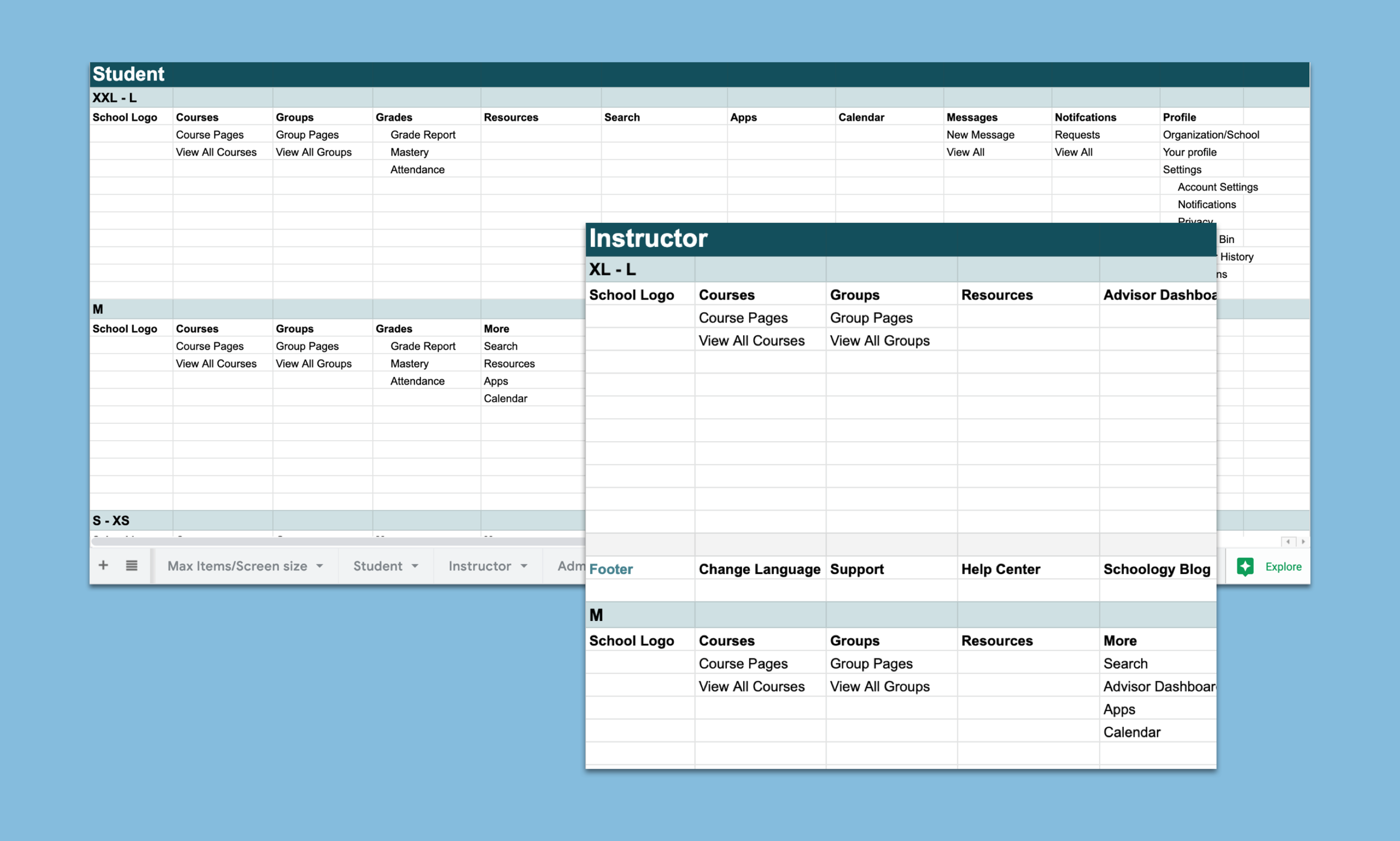
I broke out the different navigation elements like the calendar, resources, and apps for each user type and all screen breakpoints. As the screen size gets smaller the least utilized elements get hidden into a deeper menu.
Final Solution
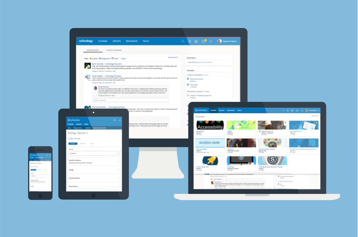
The solution ranged all device sizes in order to meet the needs of all of our users
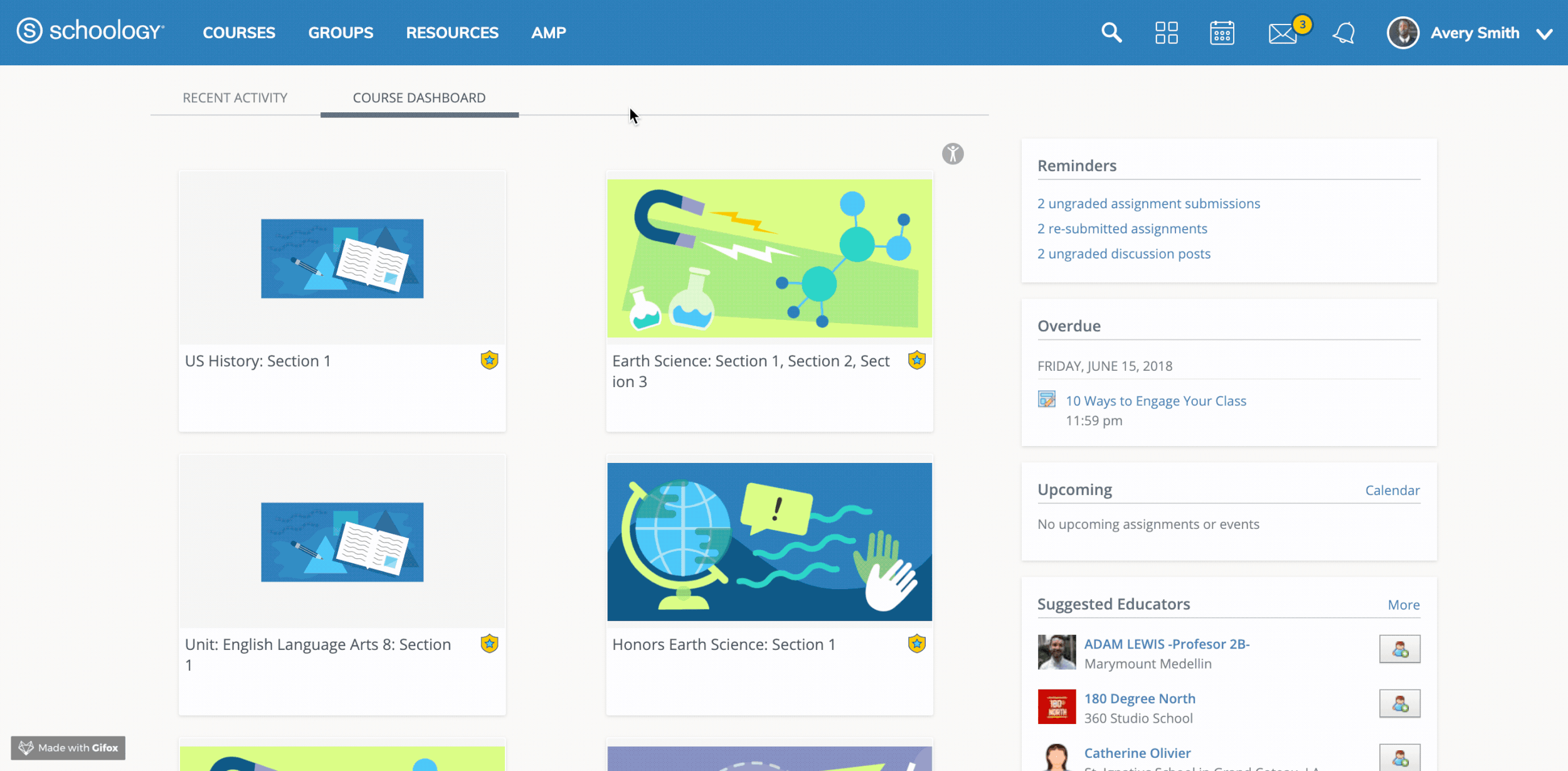
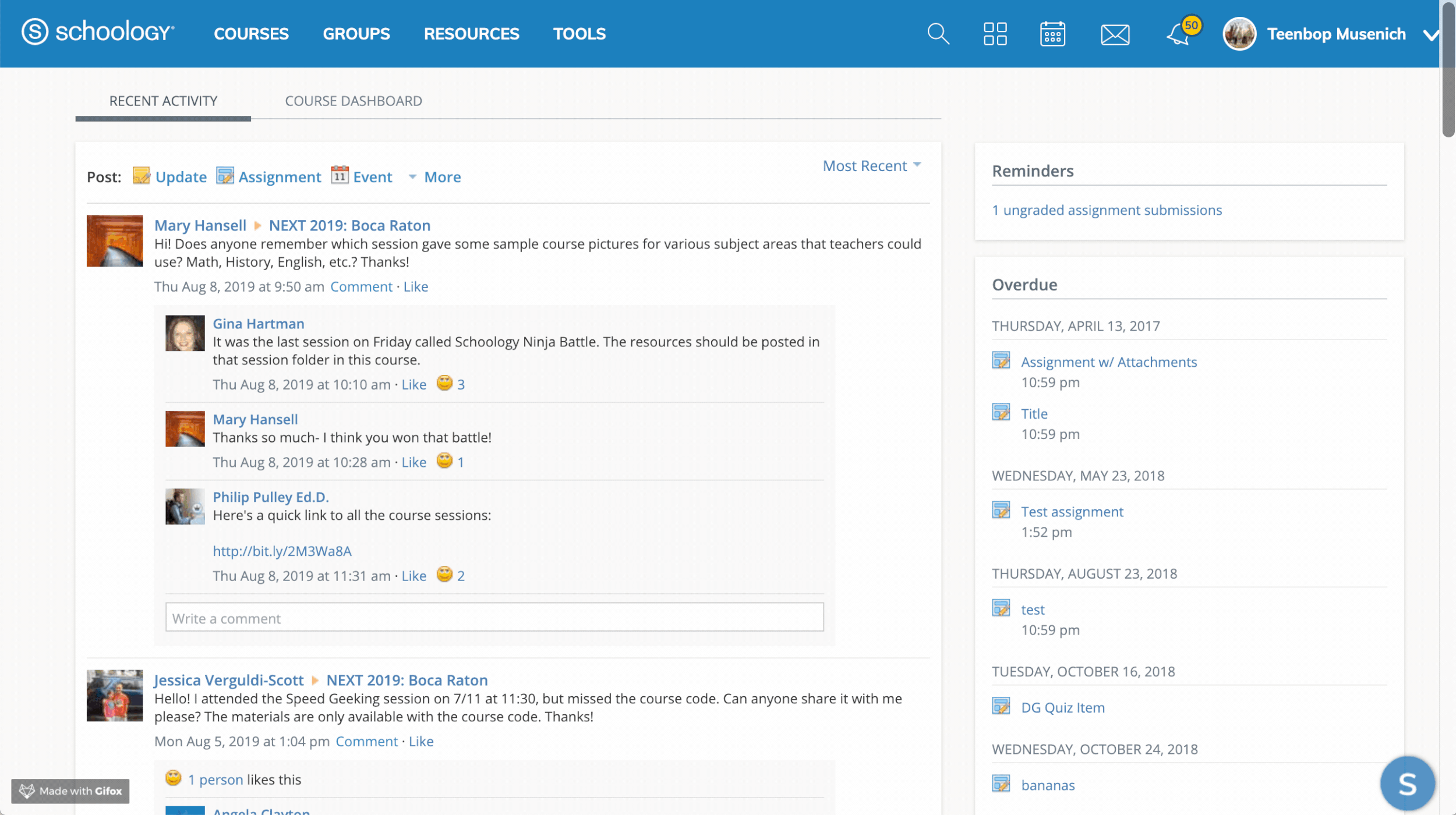
This is how teachers and students would navigate to their courses and check their messages.
An admin’s reorganized navigation which was informed by our user research

The new, responsive navigation optimized usability on all form factors.
Post-Launch Usability Testing
After most of the development was completed, I conducted 8 usability testing sessions with a mix of participants ranging from System Admins to Teacher to Students. The entire team including developers, QA, and product managers were invited to watch as users navigated around the site using our new system. The most prominent feedback was the notion that it wasn't much different than it was today. For us that was a definite win. We were not looking to disrupt our users, but to open the doors to more site functionality - like an optimized experience across breakpoints.
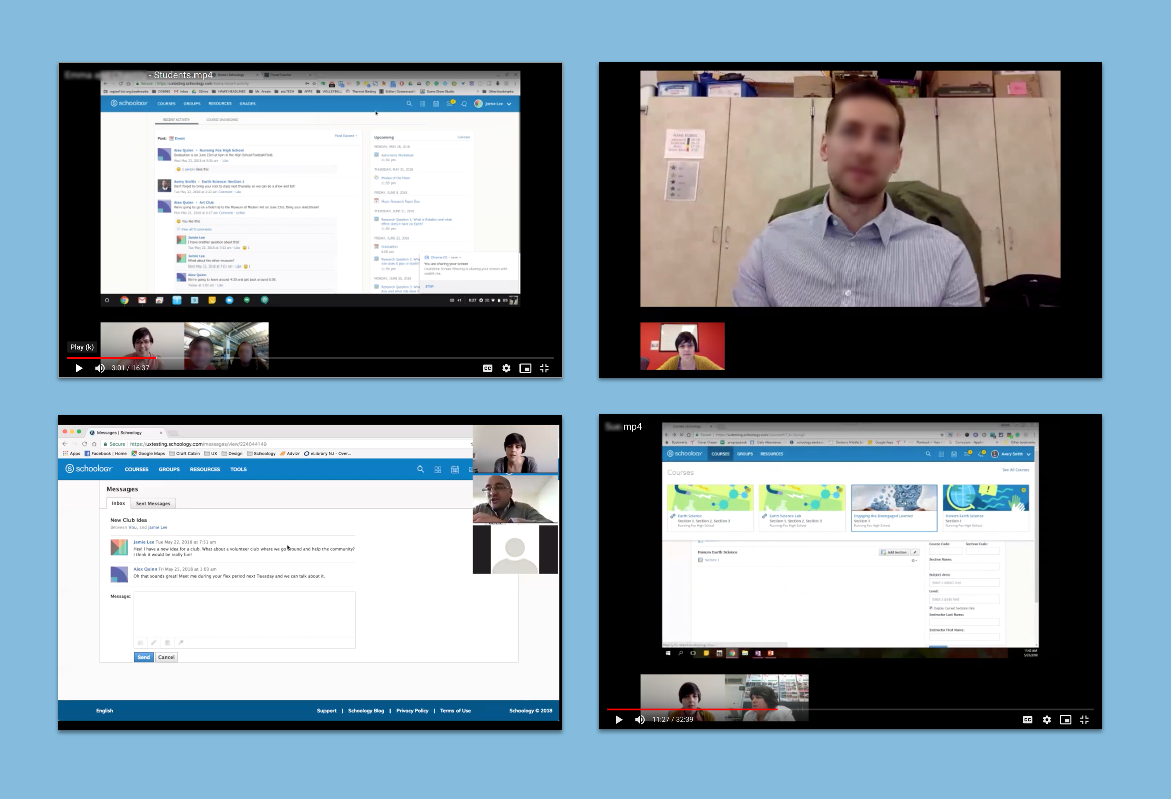
Screenshots of some user sessions we had to evaluate the implemented solution
Business Impact
Unlocked the ability for subsequent Schoology projects to be fully responsive and accessible.